And Venture Forth
& Venture Forth, aesthetics, part 1
I think we can all agree that by the late 90s we hadn't figured out how to make a good CRPG UI (and we hadn't really done it until the tail end of the 2000s).
Things ran a little experimental and there's where we find a lot of creativity. This era is also intersected with the beginnings of 3D rendering graphics, leaving way to a mish mash of low res textures, cheap lightning effects, false 3D isometric perspectives, and a ton of handcrafted sprites.
src: IGN.com
Does this mean I'm making a purposefully bad looking game? Yes, yes it does. But let me put the emphasis on purposefully.
If the goal of the game is to evoke the feeling of those late LAN party dungeons, looking the part is as important as the rules themselves. Because you see, presentation is game design.
I'm talking layout, art, typography, indexing and text. How you communicate your rules is, to the reader, the first engagement they have with a game, so I better put in the work to present the game as is: a Baldur's Gate-inspired, fantasy adventure throwback TTRPG.
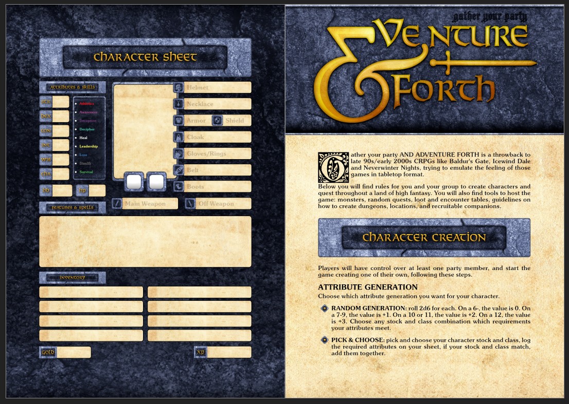
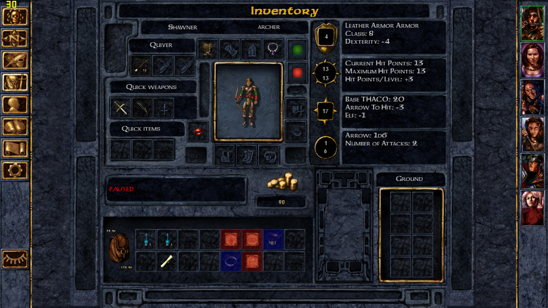
This character sheet is awful, and I love it.
& Venture Forth should look both as an old game’s inventory menu and as the booklet that came with your CD boxed set. I would love for players to get the sound effects, the music, the tactile experience of playing those video games stuck and their head, and convert it into roleplay.
And don’t get me wrong, the Infinity Engine could look gorgeous. We actually lost a piece of artistry in game media when we shifted from set pieces to open world rendering, and I love the fact that so many indie designers are keeping the torch lit. If I do things right, this will be that, but in TTRPG form!
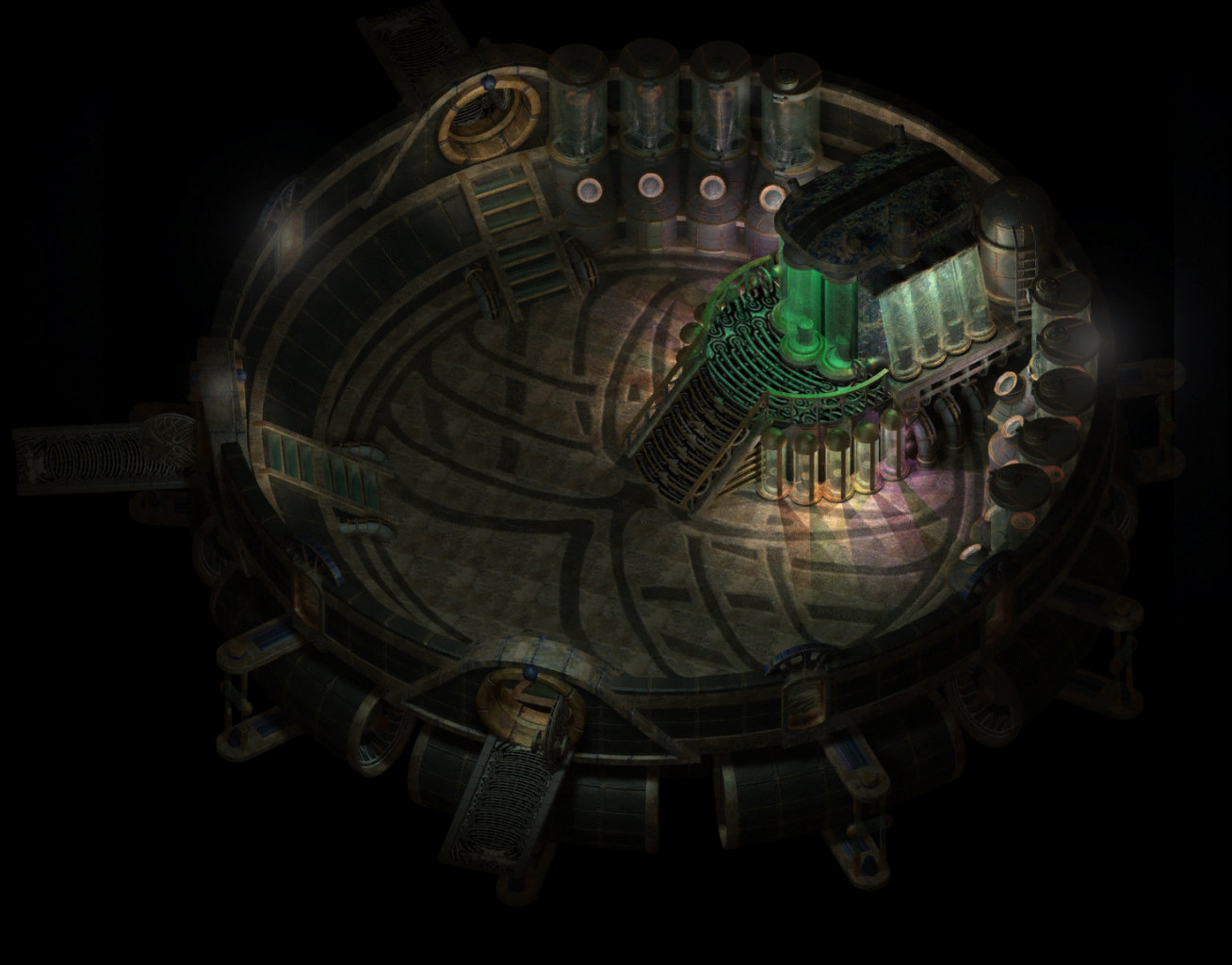
src: Baldur's Gate Wiki
Leave a comment
Log in with itch.io to leave a comment.